20 best SaaS websites for design inspiration in 2026
A curated collection of SaaS websites that stand out through thoughtful design, clear storytelling, and memorable digital experiences.

SaaS websites can be surprisingly difficult to get right.
They need to explain a product quickly, communicate trust, showcase complex features, and still feel distinctive enough to be remembered.
The best SaaS websites don't simply look good. They make the product easier to understand.
We've curated 20 SaaS websites worth exploring in 2026, looking at everything from typography and visual direction to product storytelling, navigation, interaction, and overall experience.
Whether you're designing a SaaS landing page, launching a startup, or simply looking for your next design reference, these websites are a great place to start.
What makes a great SaaS website?
There isn't one formula for a great SaaS website.
Some of the strongest examples are minimal and product-focused. Others use bold typography, immersive animation, illustration, or unconventional layouts.
But the best ones usually share a few things:
Clear positioning that explains the product quickly
Strong visual hierarchy that guides visitors through the page
Real product visuals instead of relying only on abstract graphics
Thoughtful typography that creates a distinct personality
Purposeful interaction that adds to the experience
Clear calls to action without overwhelming the visitor
With that in mind, here are 20 SaaS websites worth exploring.
1. Linear
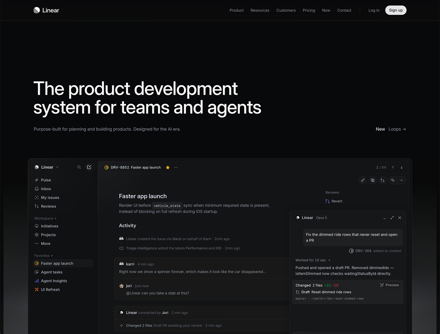
Linear is one of the strongest examples of product-led SaaS web design.
Its website puts the product and its philosophy front and center, using restrained typography, carefully crafted motion, and a highly polished visual system.
What to take away:
Show the product confidently and let the interface become part of the brand.
2. Stripe
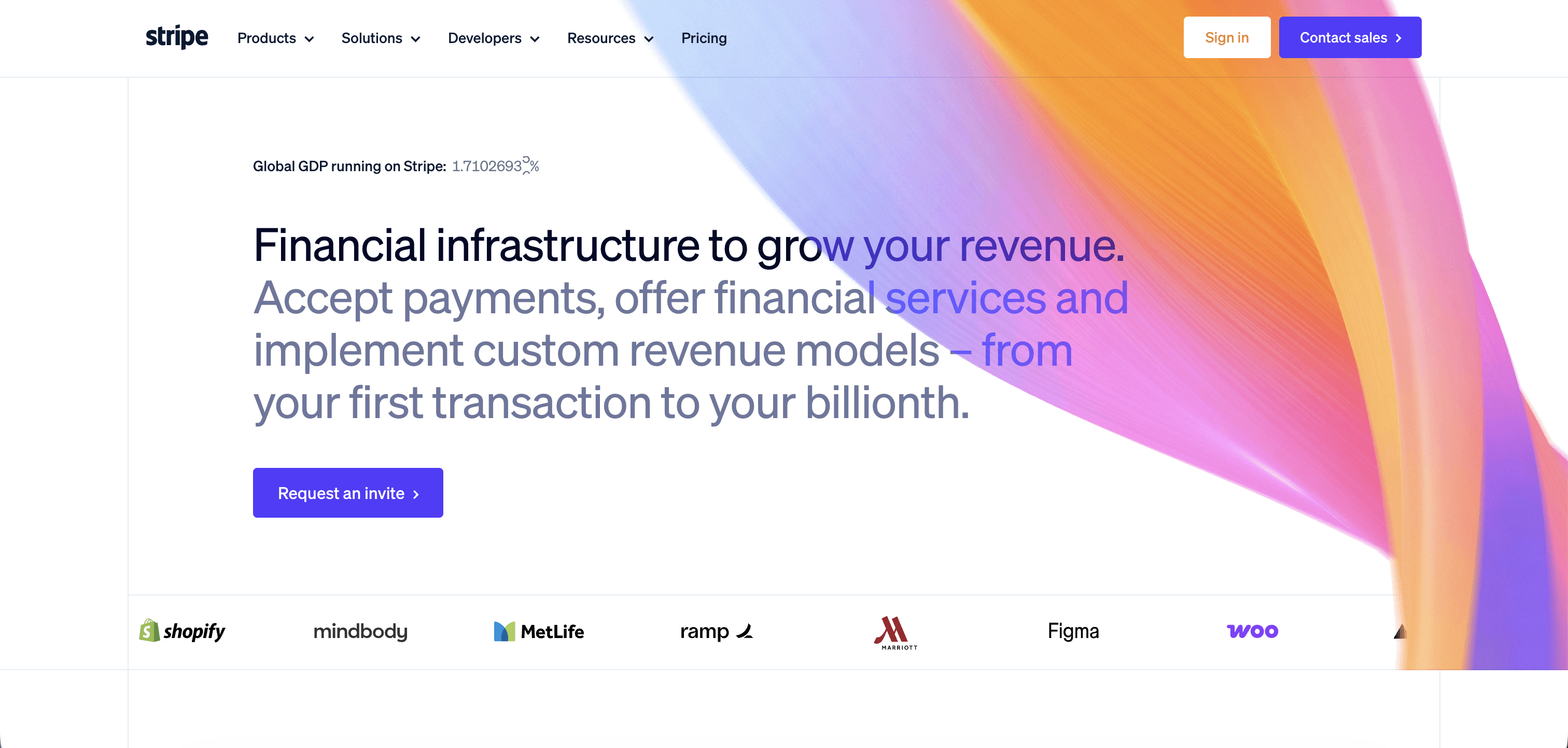
Stripe has become one of the most influential references for SaaS and fintech websites.
Its website balances technical depth with a remarkably polished visual experience, making complex products feel approachable without oversimplifying them.
What to take away:
Good SaaS design can communicate complexity without feeling complicated.
3. Attio
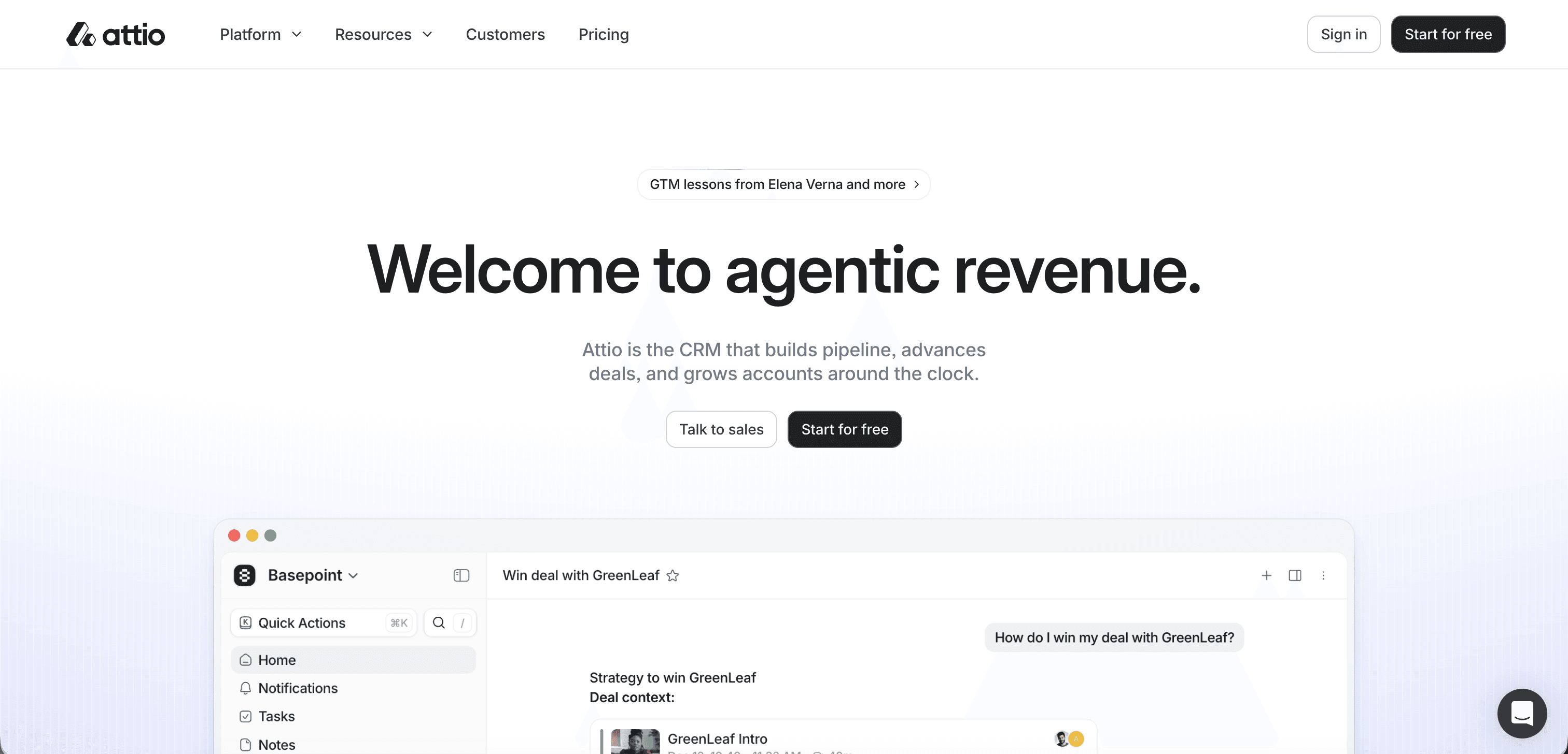
Attio takes a more editorial approach to SaaS design, combining expressive typography with product visuals and a distinctive visual identity.
The result feels closer to a modern technology brand than a traditional software company.
What to take away:
Your product category doesn't have to dictate your visual personality.
4. Vercel
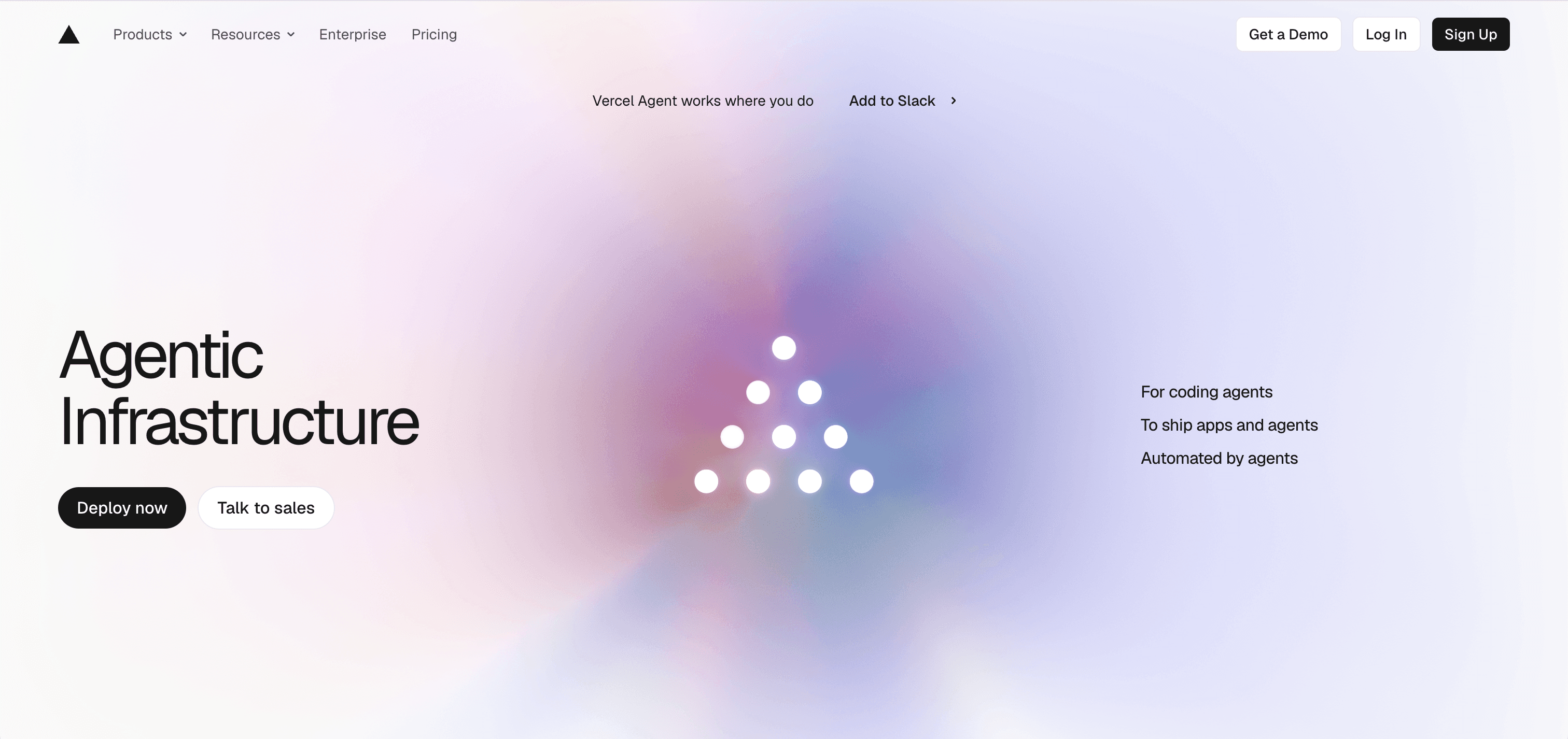
Vercel's website is a great example of confidence through simplicity.
Strong typography, technical visuals, generous whitespace, and a clear information hierarchy create a website that feels unmistakably developer-focused.
What to take away:
When your audience is technical, clarity and precision can become part of the brand.
5. Ramp
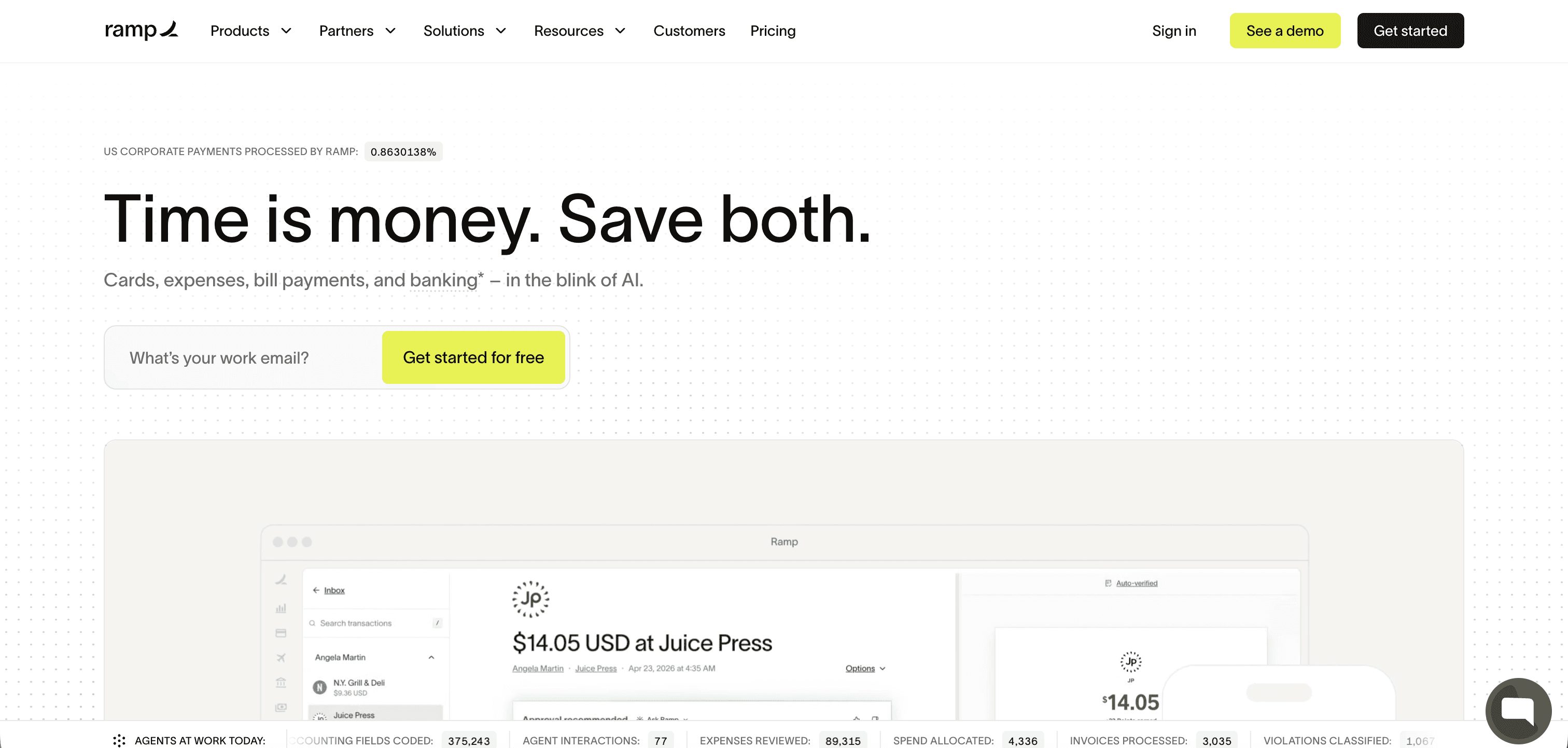
Ramp combines product storytelling with strong social proof and a confident visual identity.
The website makes financial software feel modern without losing the credibility expected from a financial platform.
What to take away:
Use numbers, customers, and product evidence to make ambitious claims believable.
6. Framer
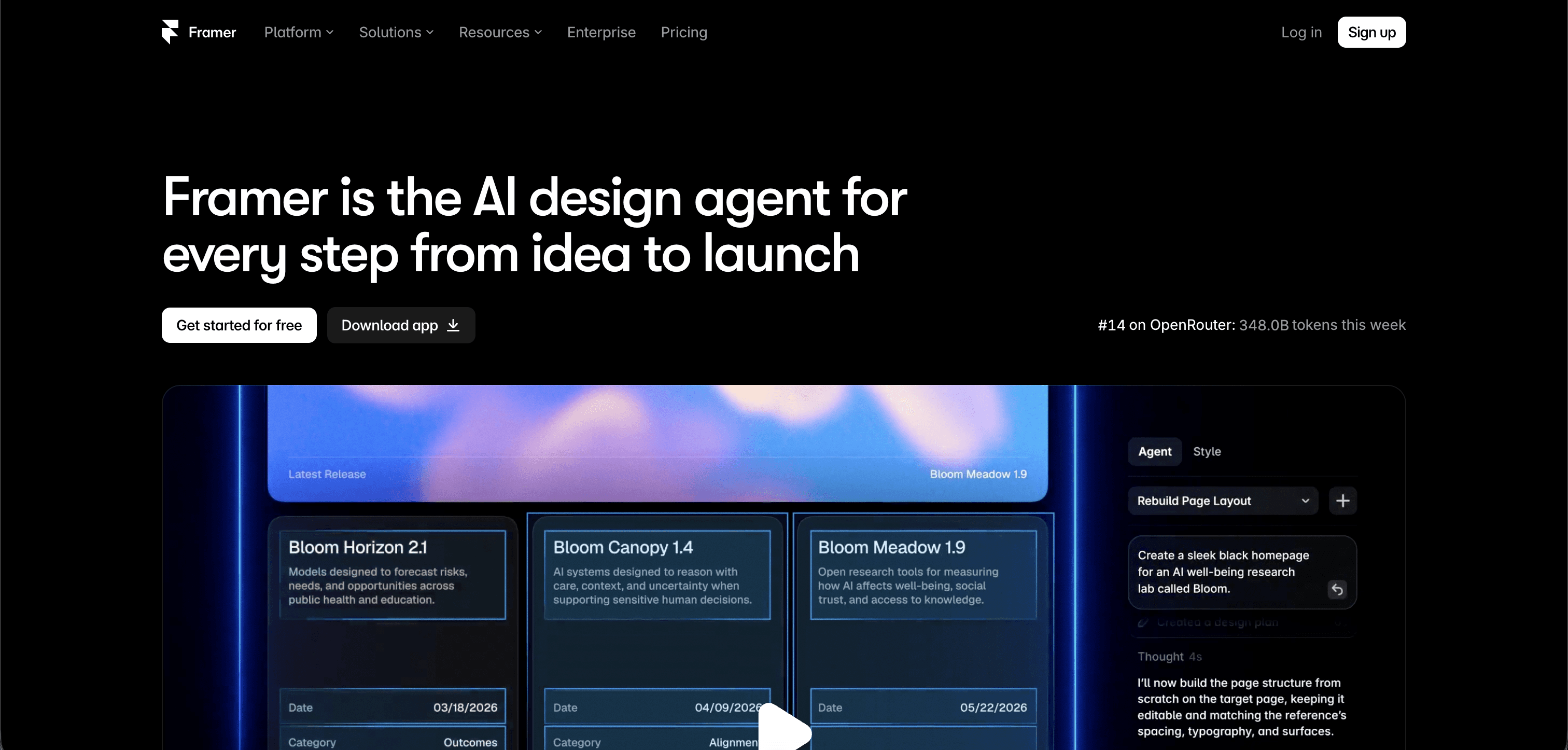
Framer's website does something particularly well: it demonstrates what the product can create instead of simply explaining it.
The website itself becomes a showcase for the platform.
What to take away:
If your product is visual, your website should be one of your best demonstrations of it.
7. Webflow
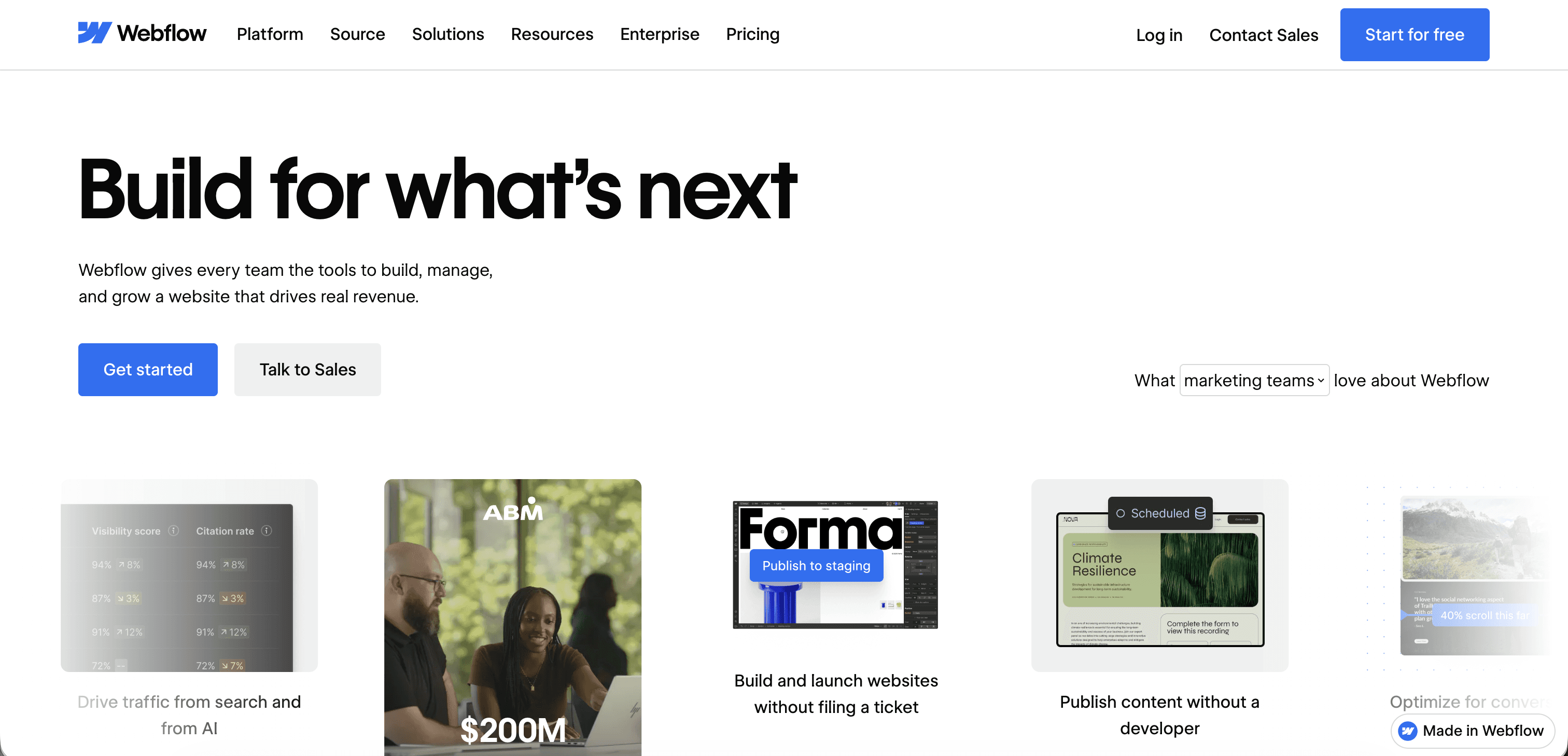
Webflow continues to demonstrate how a complex platform can communicate a broad product ecosystem through structured storytelling, strong visuals, and clear navigation.
What to take away:
Break a large product into understandable stories rather than presenting everything at once.
8. PostHog
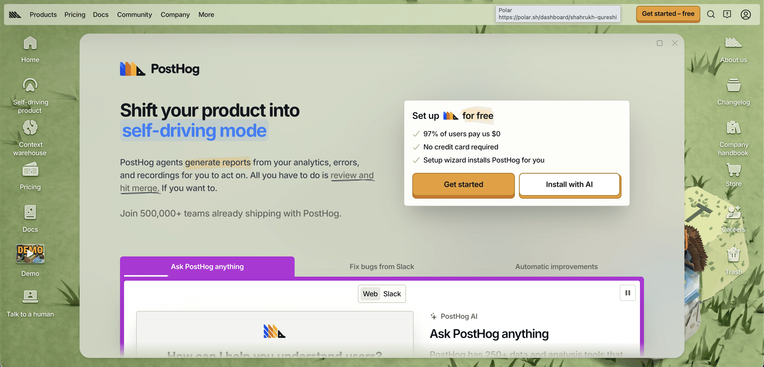
PostHog takes a very different approach.
Its personality comes through in the copy, visuals, illustrations, and sometimes playful tone, making a technical analytics product feel approachable.
What to take away:
Personality can be a competitive advantage in crowded SaaS categories.
9. Resend
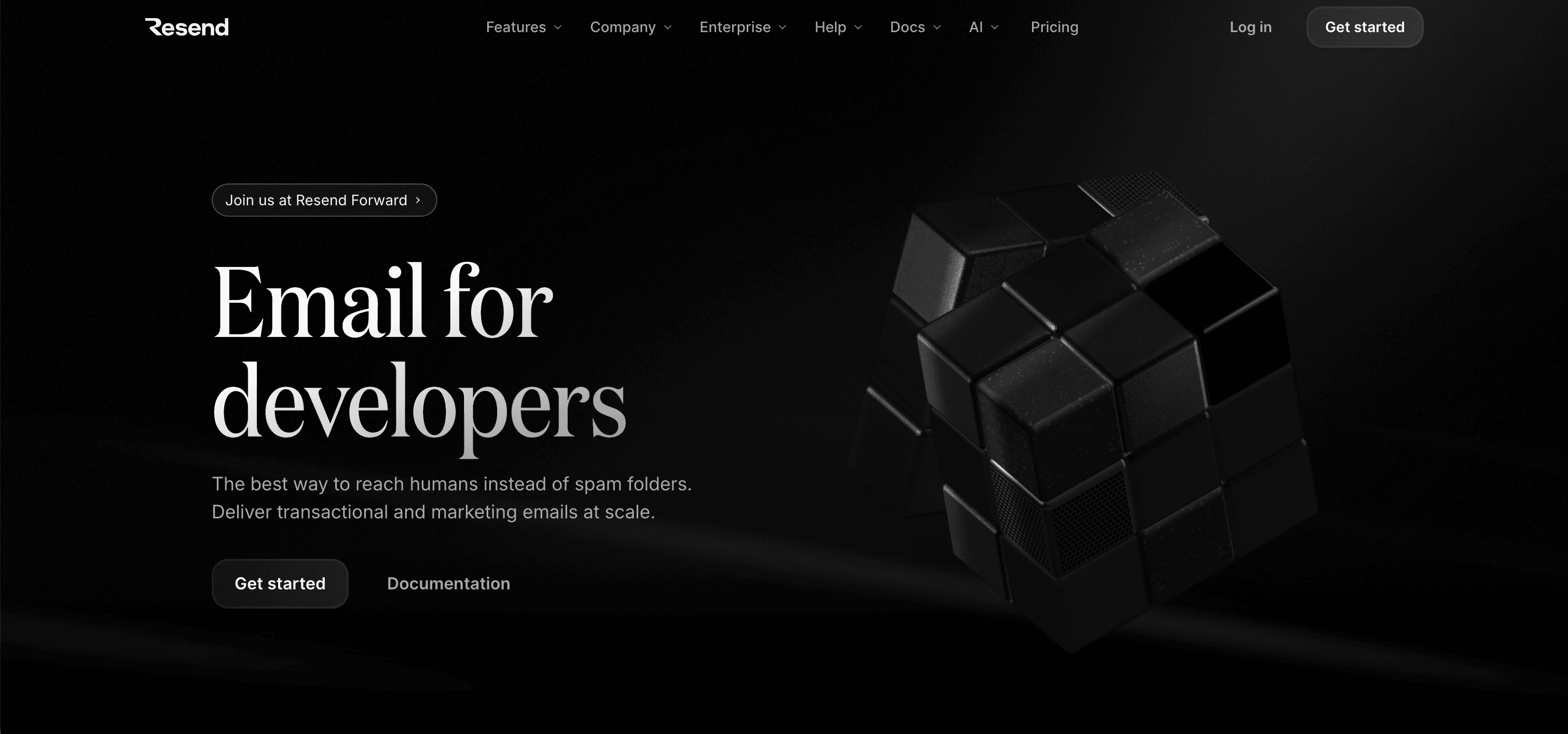
Resend is a great example of a developer-focused product using its audience's language as part of its visual identity.
Code, typography, and product visuals work together rather than feeling like separate marketing elements.
What to take away:
Design for the people actually using the product, not an imaginary broad audience.
10. Clay
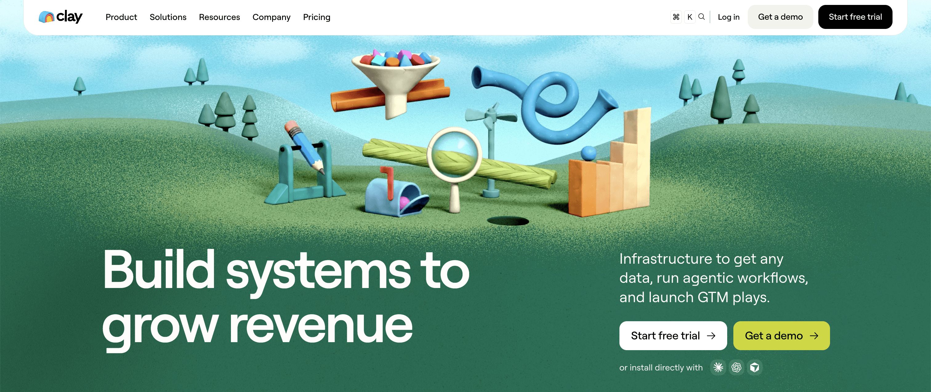
Clay stands out because it doesn't look like a typical B2B SaaS company.
Its expressive visual identity, animation, and product storytelling give the brand a distinctive personality.
What to take away:
A strong visual identity can make a familiar product category feel new.
11. Cursor
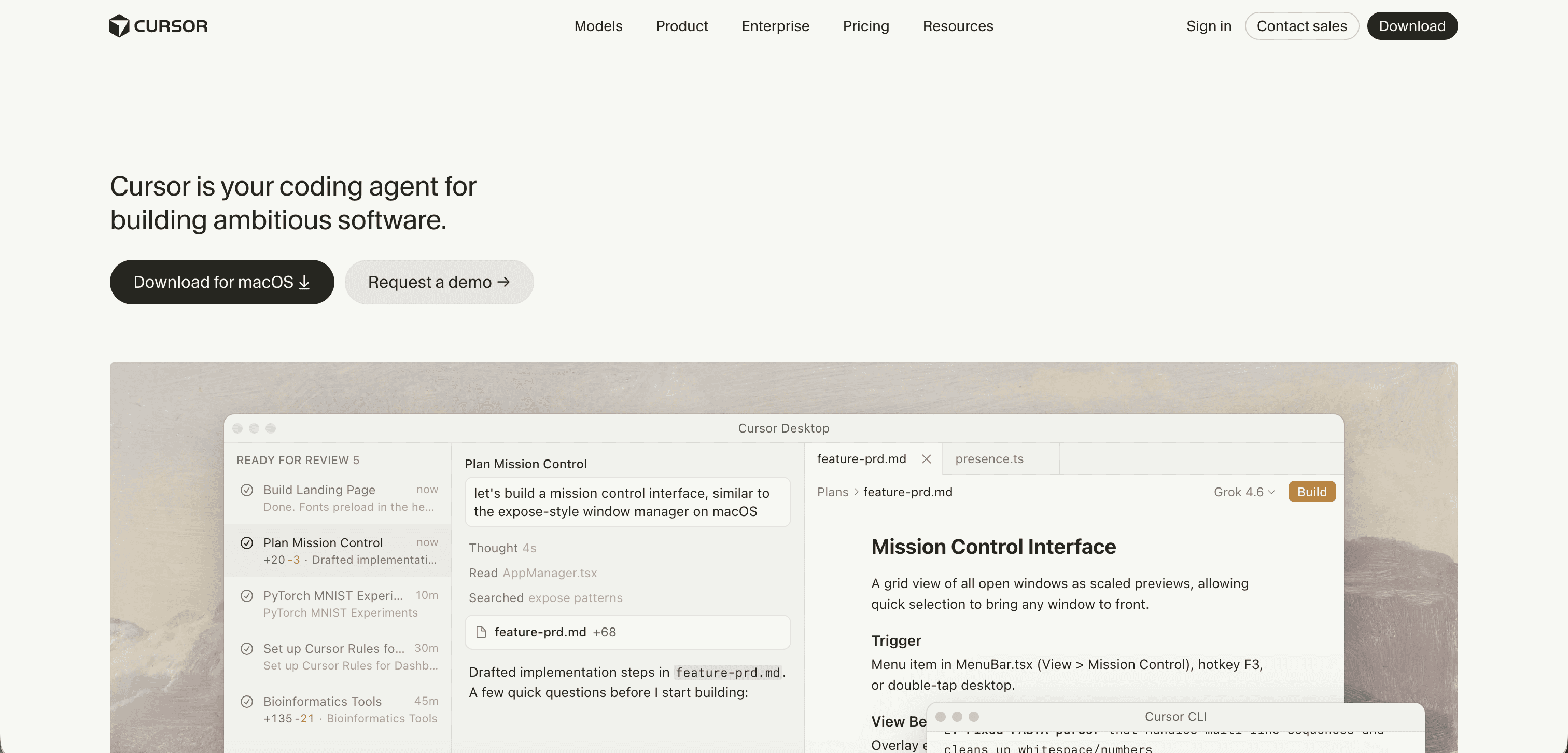
Cursor's website leans heavily into the future of software development.
The visual language feels technical and ambitious while keeping the product itself at the center of the story.
What to take away:
Your website should communicate not only what your product does, but where the category is going.
12. Figma
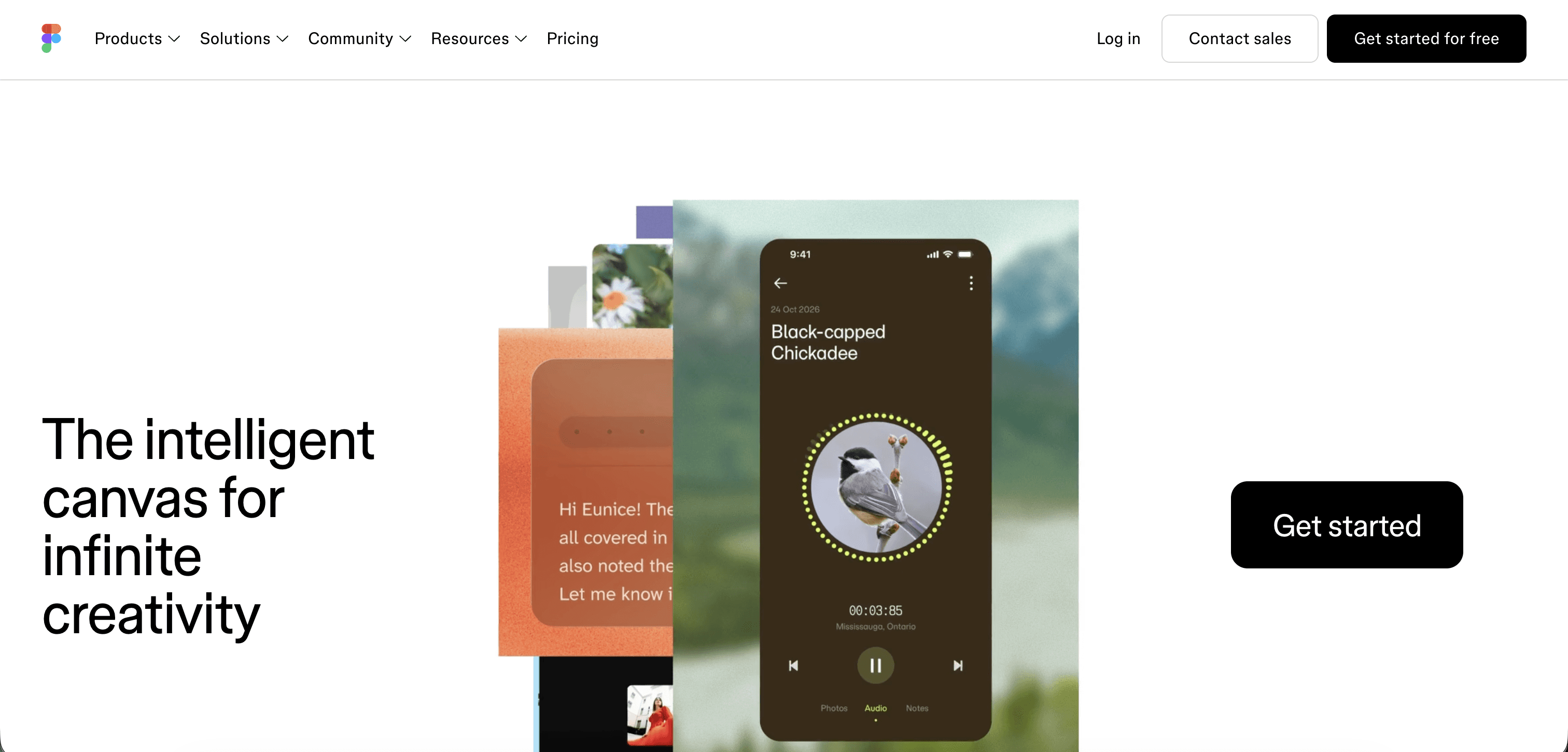
Figma's website reflects the collaborative nature of the product through colorful visuals, product demonstrations, community content, and a strong brand system.
What to take away:
Your website can communicate your product's core behavior through its own design language.
13. Spline
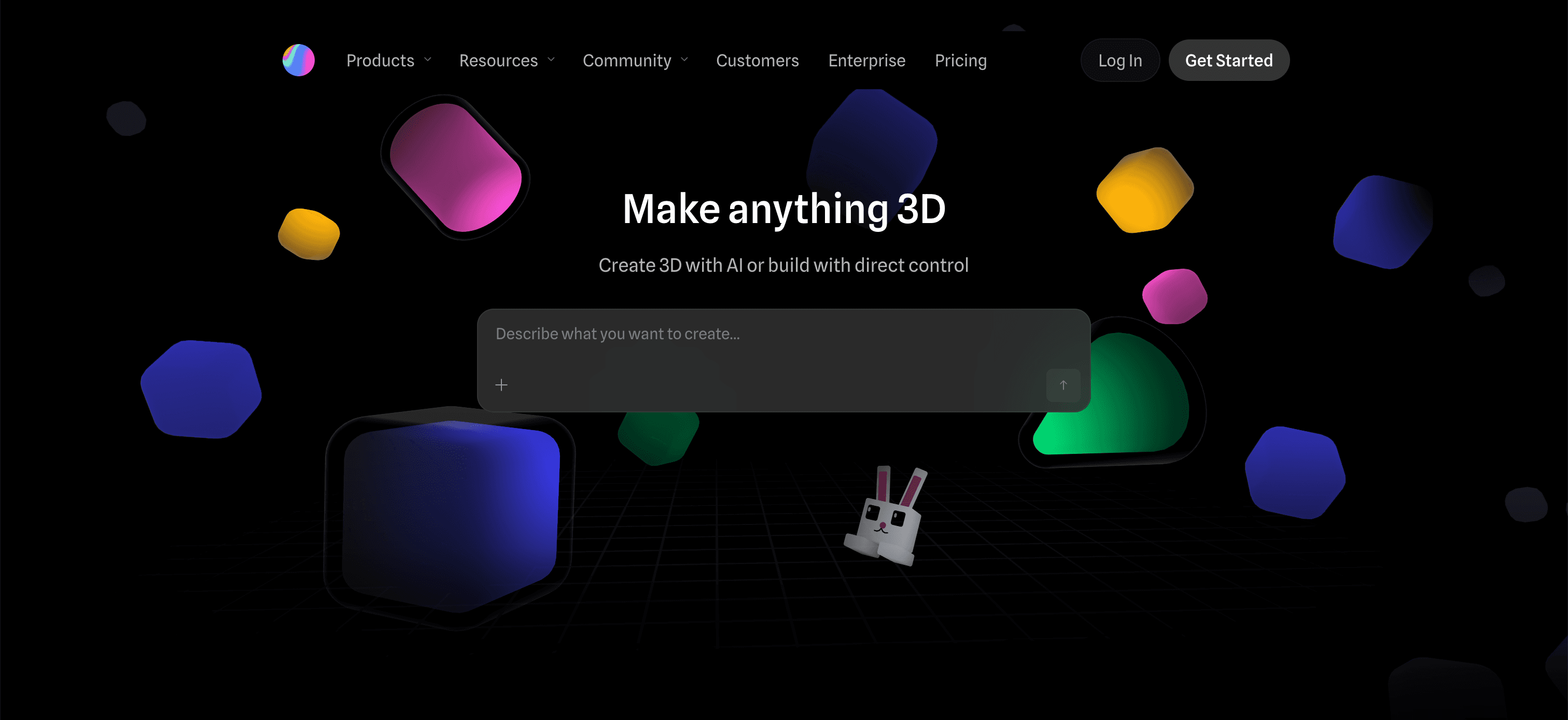
Spline uses 3D and interactive visuals to demonstrate exactly what makes the product different.
Instead of telling visitors that the platform is creative, the website lets them experience that creativity.
What to take away:
Demonstration is often more powerful than description.
14. Notion
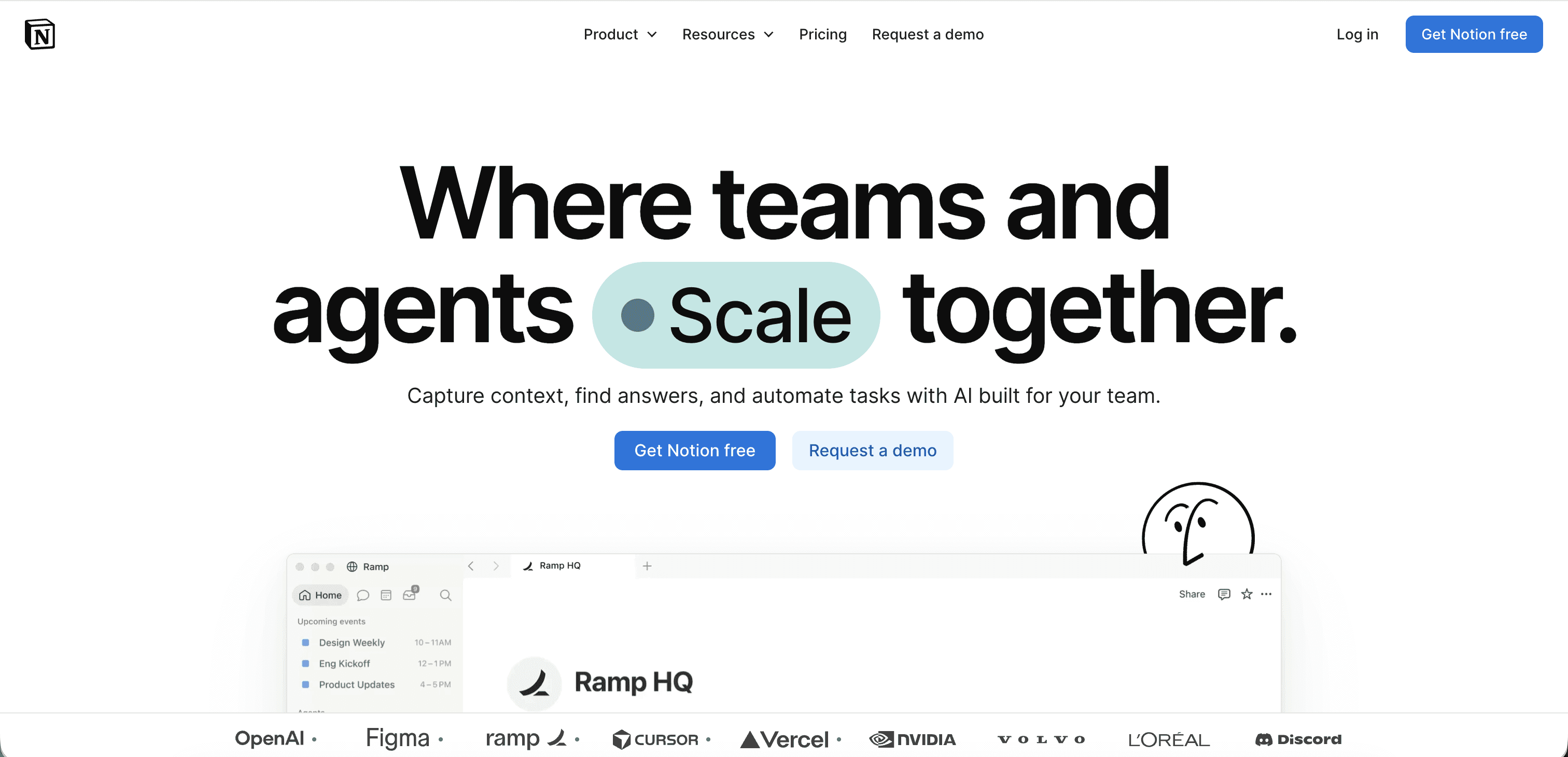
Notion's website combines a relatively simple visual system with strong storytelling and product education.
The website makes a broad, flexible product easier to understand by presenting specific use cases.
What to take away:
When your product can do many things, show people what they can accomplish with it.

15. Raycast
Raycast has built a distinctive identity around speed, productivity, and software craftsmanship.
The website uses product visuals and concise messaging to communicate that positioning.
What to take away:
A focused product promise can make the entire website feel more cohesive.
16. Loom
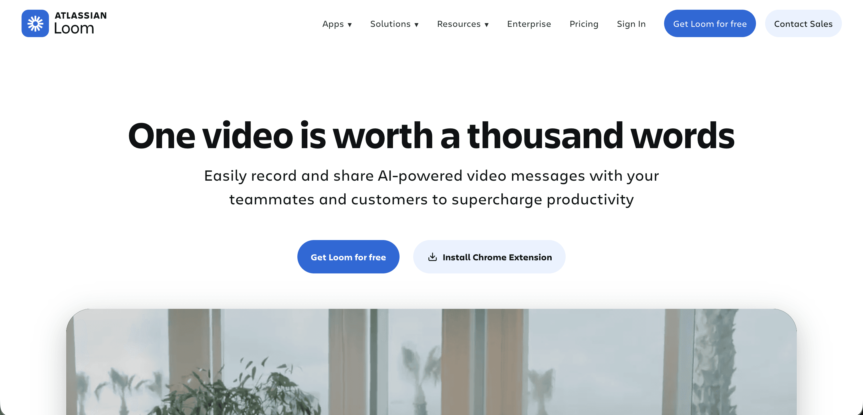
Loom understands that its product is fundamentally about communication.
Its website uses video, product demonstrations, and approachable messaging to explain that idea almost immediately.
What to take away:
Use the medium your product is built around whenever possible.
17. Pitch
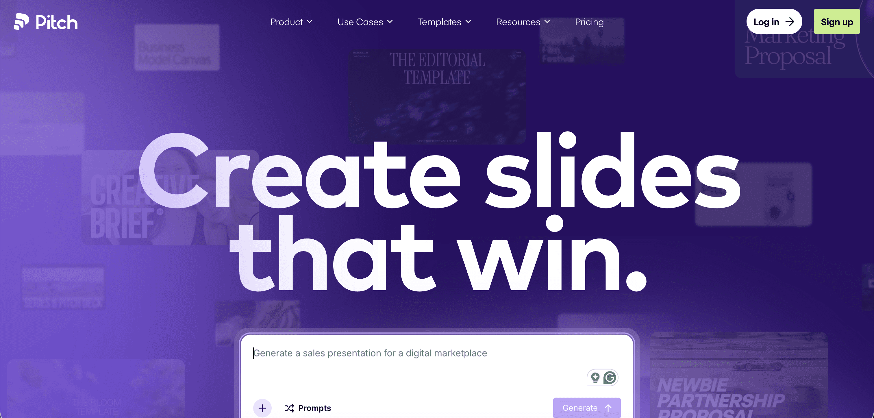
Pitch combines presentation software with a strong editorial visual identity.
The website feels creative and premium while still making the product understandable.
What to take away:
Don't be afraid to let your marketing website feel like an extension of the product experience.
18. Mercury
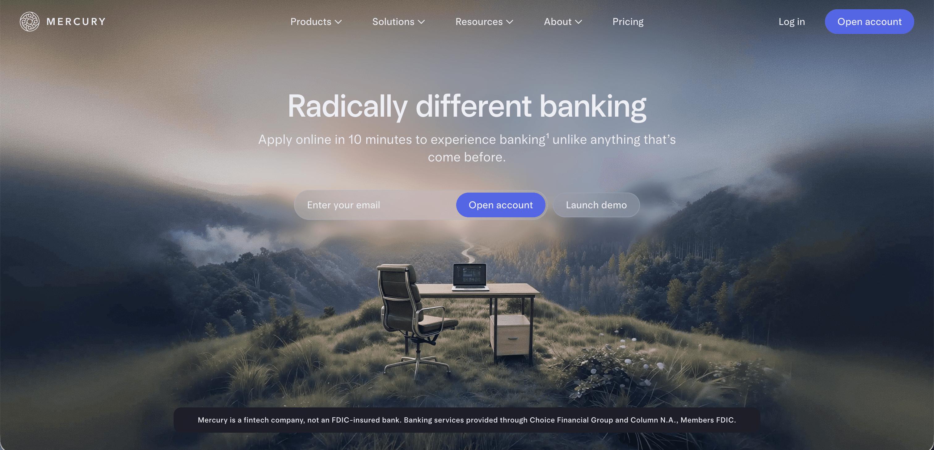
Mercury takes a more sophisticated approach to financial technology.
The website combines editorial imagery, typography, product visuals, and strong storytelling to create a premium experience.
What to take away:
Visual sophistication can help differentiate products in traditionally conservative categories.
19. Giga
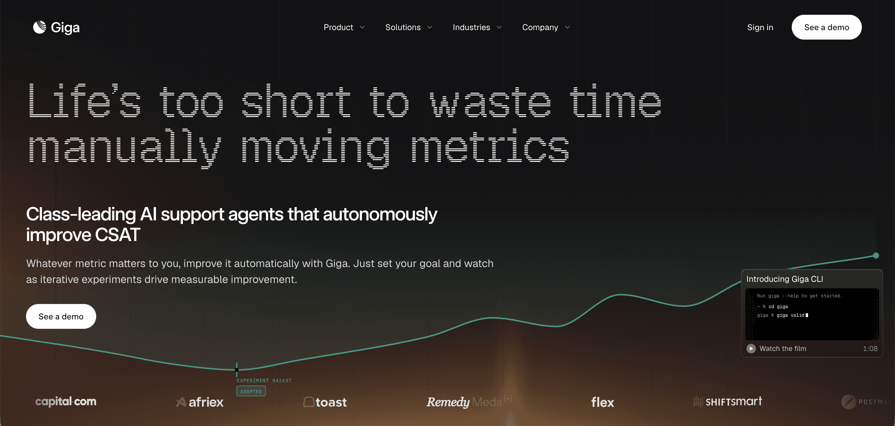
Giga's website takes an AI-first approach to customer support, using a strong product story and visual system to communicate an otherwise complex proposition.
What to take away:
For emerging categories like AI, clarity matters even more because visitors may not have an established mental model.
20. Cofounder
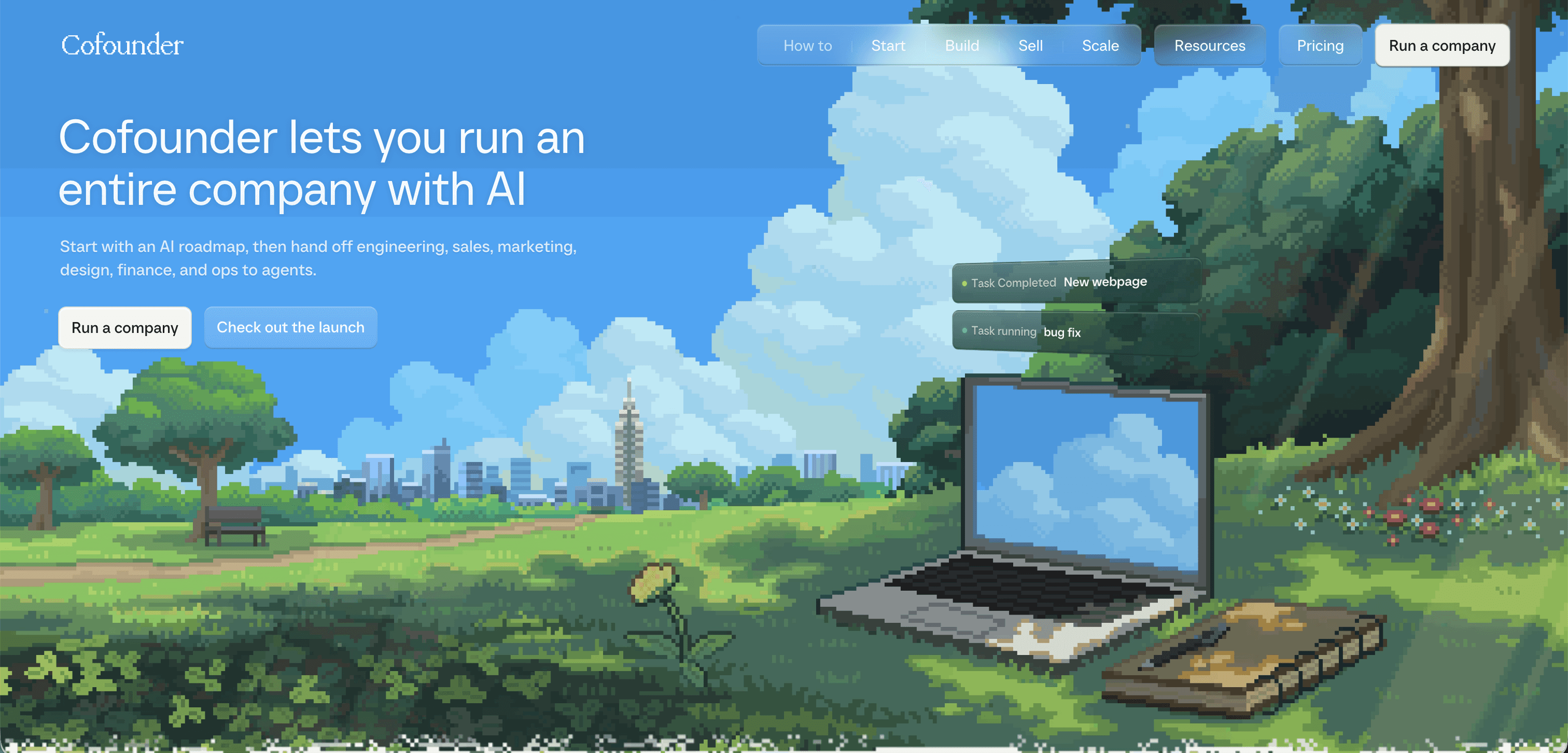
Cofounder is a strong example of a technology website using simplicity and focused messaging to communicate an ambitious product.
What to take away:
You don't need dozens of sections to make a strong impression. A clear idea executed well can be enough.
What the best SaaS websites have in common
Looking across these websites, one thing becomes clear: there isn't a single SaaS aesthetic.
Some are minimal. Some are expressive. Some are technical. Some are editorial.
What connects them is intentionality.
The strongest websites know what they want visitors to understand, and every part of the experience supports that goal.
1. The product appears early
Visitors shouldn't have to scroll through several marketing sections before seeing what they're actually buying.
2. Typography has a role
The best SaaS websites don't treat typography as decoration. Type helps establish personality, hierarchy, and trust.
3. Visuals explain
Product interfaces, animations, diagrams, and interactive elements aren't simply there to make the page impressive. They help explain the product.
4. The brand goes beyond the logo
Color, typography, imagery, motion, illustration, and copy all work together to create something recognizable.
5. Less can be more
The strongest websites aren't necessarily the ones with the most sections. They are the ones where every section has a reason to exist.


